Seeing as the last post on this blog was almost a year ago, we’ve decided to make it official and close Contech. We’ll keep the blog online for posterity’s sake, but there will be no new posts and we’ve turned off comments.
Thanks for reading!
Seeing as the last post on this blog was almost a year ago, we’ve decided to make it official and close Contech. We’ll keep the blog online for posterity’s sake, but there will be no new posts and we’ve turned off comments.
Thanks for reading!
Don Tapscott, who wrote Growing Up Digital, has an intriguing post in which he argues that the digital revolution will transform higher education to such an extent that it will lead to the demise of the university as we know it.
In Tapscott’s view, small, selective liberal arts colleges (SLACs) are the best prepared to meet the challenges of the digital era. Other types of institutions will not fare as well:
But the same cannot be said of many of the big universities that regard their prime role to be a centre for research, with teaching as an inconvenient afterthought, and class sizes so large that they only want to “teach” is through lectures.
These universities are vulnerable, especially at a time when students can watch lectures online for free by some of the world’s leading professors on sites like Academic Earth. They can even take the entire course online, for credit. According to the Sloan Consortium, a recent article in Chronicle of Higher Education tells us, “nearly 20 per cent of college students — some 3.9 million people — took an online course in 2007, and their numbers are growing by hundreds of thousands each year. The University of Phoenix enrolls over 200,000 each year.”
It’s a provocative notion, but I think that Tapscott underestimates the the importance of context (setting, peer pressure, inspirational professors) for motivating students. And, on the “demand” side – or student side, I think that Tapscott wildly overestimates the level of student motivation to learn in the absence of the context of higher education. Later in this long post, he points to the example of MIT’s Open CourseWare as an ideal type:
Some are taking bold steps to reinvent themselves, with help from the Internet. Massachusetts Institute of Technology, for example, is offering free lecture notes, exams and videotaped lectures by MIT professors to the online world. Anyone in the world can watch the entire series of lectures for some 30 courses….
While there may be interest in online courses of ‘star’ professors, I’m skeptical about how motivated potential students might be without the incentives of grades, deadlines for assigned coursework, and the degree credential. Tapscott’s over-the-top optimism about the desire for learning among the generation he refers to as “digital natives” strikes me the perspective of someone who has never stood before a class and asked, “has anyone done the reading?” only to look out a sea of blank faces staring back.
The prediction about the demise of the university may be premature, as were the predictions a decade or more ago, about the demise of the book. Yet, like the publishing of books has been modified somewhat by the growth of e-books and digital readers like the Kindle, the university – rather than come to an end – is going to be modified in some ways by the digital revolution. At this point, no one knows what those changes will be.
There is a limit to how many blogs one person can reasonably be expected to maintain and over the last few months, I exceeded my personal limit by a couple of blogs. Now, two of those blogs have met their demise (one by design when a class ended; the other by accident – user error more likely – when I switched web hosts). So, clearing the cobwebs, I’m happy to be back.
Dan Gilmor, of the Berkman Center for Internet and Society at Harvard, has an interesting essay on the Principles for a New Media Literacy. In it, he writes this:
“…the expanding and diversifying media ecosystem poses some difficult challenges alongside the unquestioned benefits. A key question: In this emergent global conversation, which has created a tsunami of information, what can we trust?
How we live, work, and govern ourselves in a digital age depends in significant ways on the answers. To get this right, we’ll have to re-think, or at least re-apply, some older cultural norms in distinctly modern ways.”
In the essay, Gilmor goes on to note several of the many ways that information on the web can be suspect including the stealth marketing by companies like Proctor & Gamble and Wal-Mart, sock puppets and PayPerPost bloggers. He offers some sage advice about how to protect against these sorts of credibility issues, and the whole essay is worth reading.
Although Gilmor doesn’t use the word, I think it’s fair to characterize these examples I listed above as types of propaganda, that is, it’s meant to sway people’s opinions (often against their will) in the service of a particular agenda. Perhaps the clearest example of this is case of the South Dakota bloggers who, only after the election, people learned were paid political consultants for the winning candidate Thune, who defeated Daschle.
This is something I’ve thought a good deal about, in particular around what I refer to as cloaked sites, that is, websites published by individuals or groups who conceal authorship in order to deliberately disguise a hidden political agenda (I have an article coming out in 2009 in the journal New Media & Society that explores this phenomenon in some depth, and I examine in my forthcoming book as well). Propaganda, I contend, is much more difficult to discern in the digital age. And the research I’ve conducted supports this contention.
Most of the sociological literature on propaganda dates from the post-WWII period, a time when many sociologists were fascinated by governments’ use of propaganda (e.g., Howard Becker published “The Nature and Consequences of Black Propaganda,” American Sociological Review 14 (Apr. 1949): 221-235). Particularly relevant to the issue of resisting propanda – which is part of what Gilmor is suggesting we do with his principles of media literacy – is the work of the late Alfred McClune Lee. In a 1950 article in Social Forces, called “Can the Individual Protect Himself [sic] Against Propaganda Not in His [sic] Interest?” 29 (1950):56-61. Lee argues that:
“A grasp of propaganda analysis is a central goal of a liberal arts education.”
What was true in 1950 is true today, almost sixty years later. However, the world in which that propaganda appears has changed dramatically. Now, government propaganda in which those in power try to sell us on an unnecessary war exists alongside propaganda that seeks to sell us political candidates, television reality shows, and toothpaste. And, all of these forms of propaganda exist within a media environment that is dispersed, many-to-many (rather than one-to-many), and easily accessible to a huge number of people. This raises interesting quesitons for sociologists who are research social movements, countermovements, organizations, politics, state power, popular culture. And, if as Lee suggested sixty years ago, the central goal of a liberal arts education is to have a grasp of propaganda analysis, then the emergence of hard-to-discern propaganda in the digital era raises real challenges for all sociologists who teach.
Stumbled upon an article from JAMA, the leading medical journal, about YouTube. Interesting and oddly fun juxtaposition: JAMA/YouTube. The authors did a one day (February 20, 2007) search of videos at YouTube using the search terms vaccination and immunization. The goal of the research was to find out about the “quality and veracity of information” about immunization available on YouTube. In the dry, buttoned-down and passive voice of JAMA, here’s what the study concluded:
Approximately half of the videos posted were not explicitly supportive of immunization, and information in negative videos often contradicted the reference standard. The video ratings and view counts suggest the presence of a community of YouTube users critical of immunization. Clinicians therefore need to be aware of Internet video-sharing sites and should be prepared to respond to patients who obtain their health information from these sources. The potential use of these sites for effective communication by health professionals should also be considered.
In other words, a lot of people posting videos on YouTube about immunization are not complying with the medical experts’ view about the value of getting kids immunized. And, in fact, there’s a whole community of folks at YouTube who would like very much to counter that received wisdom from medical experts. The authors conclude by cautiously suggesting that perhaps health professionals take a look at the “potential use” of sites like YouTube for “effective communication” by health professionals.
I share this JAMA article for a couple of reasons. One, I think it raises some really interesting questions about the disruption of the whole notion of “expertise” in the digital era. A disruption I was reminded about when I gave one of my last lectures of the semester about “Urban Society & Health” and talked about the HIV/AIDS epidemic. A student raised his hand and shared with the class his view that the epidemic in Africa wasn’t really the result of HIV/AIDS but that the disease was used as a cover for other diseases that had existed on the continent “forever,” and that HIV/AIDS was merely a useful fund-raising mechanism. He was certain of this because, of course, he’d read it on “the Internet.” Undergraduate logic aside, the disruption of expertise in the digital era is a difficult one to know how to address. And, this disruption of expertise is particularly vexing when it comes to the areas of health, illness and medicine, in part because people’s lives are often at stake, and also because these have been such contested areas of knowledge in the historical period known as the ‘pre-Internet period.’ (For more on the political contests over medical expertise, see Paul Starr’s classic book on this, The Social Transformation of American Medicine.) The history of the Internet era is still being written and I, for one, will be fascinated to see how this battle over expertise and scientific knowledge about health, illness and medicine plays out in the digital era.
The second reason I share this JAMA article is that I am fascinated by the question: How do you sample YouTube? I’m at work on a study involving YouTube at the moment, so I’m interested in what these authors did in this piece methodologically.
If you’re a sociologist and have been trained in (or, at least had a class or two in) sociological methods, then you know that one of the guiding principles for finding a random sample is having a “universal list” or a sampling frame, from which to draw your sample. This requires knowing, or at least having a list of, all the members of a population, or the group about which you want to generalize. And this is where the difficulty comes in when a researcher confronts YouTube.
How do you sample YouTube? One of the problems is that videos come and go to YouTube, and so the given “universe” of videos available on any given day may change. What the researchers did here was to basically use two search terms (vaccination and immunization) on one single day. Then, they had outside evaluators categorize the videos as “positive” /”substantiated” (consistent with Canadian Immunization Guide standard), “negative” / “unsubstantiated” (counter to the Canadian Immunization Guide) or “ambivalent” (not clear either way). There’s a lot more information on YouTube about each video that these researchers don’t take into account, like length of time on the site, which has a very significant bearing on the traffic and the ratings.
The researchers do consider the “rating” that users had given the videos on the site, and what they found was telling but unexplored in ths piece. Among videos rated “postive,” that is consistent with medical experts’ thinking about immunization, videos that were public service announcement received the lowest mean scores. Given the authors’ conclusion that health professionals should consider the “potential use” of YouTube, this strikes me as an inherent contradiction. The research seems to suggest that the videos that get real traction on YouTube are the ones that counter the experts’ opinions and go against the prevailing wisdom.
Several years ago, people in lots of cities and municipalities around the U.S. formed volunteer organizations to establish free wireless Internet access (wifi) in public places. The one where I live, NYCwireless, has been active since 2001, and the organization has worked to builr free, public wifi networks in over ten New York City parks and open spaces through partnerships with local parks organizations. My favorite of these is the wifi at Bryant Park, just behind the main New York Public Library, in part because there are ample movable chairs and tables so the park easily becomes an outdoor workspace.
Broadband companies around the U.S. have pulled out of their original support for free wifi in cities. Verizon, in particular, has been especially aggressive about killing free wifi in NYC.
Now, the Bush administration is – as ever – using government to support the interests of industry. Bush’s Secretary of Commerce, Carlos Gutierrez, sent a letter to the FCC chairman expressing the administration’s displeasure with the idea of free wifi.
All of this raises a fundamental question about how we think about wireless Internet access. If we conceptualize it as a privilege, then only those who can afford to pay the full price set by companies like Verizon, have access to it. In this way of thinking about it, wireless Internet access is a luxury item, like high-definition cable tv.
If, instead, we conceive of Internet access as a public utility – like clean running water – then providing it becomes a different sort of issue. When thought of in this way, free wifi becomes something of a social justice issue in which the goal is to provide a majority of the people with a utility that will improve their lives. Robin Mansell makes a persuasive case for this latter view in his 2002 article, “From Digital Divides to Digital Entitlements in a Knowledge Society,” (Current Sociology, 50 (3). pp. 407-426). Mansell contends that we need to move away from thinking about Internet access exclusively in terms of access, affordability, and capabilities and skills for employability in industry and instead, think of ways to configure new media technologies as onfigured in ways that could enable the majority of people to strengthen their abilities to make choices about how they wish to live their lives. Mansell argues that a rights-based approach to new media policy is essential and that it must be based upon a fundamental notion of peoples entitlement to new media technologies in emerging knowledge societies.
It’s a provocative stance, but one I’m persuaded by. Based on my current research with homeless, LGBTQ youth in New York City, I see first-hand how new media technologies make a difference in these kids’ lives. Most of them have Internet-enabled “smart” phones and they consider these crucial tools for survival on the streets, not luxuries. And, increasingly, homeless people across the country rely on the Internet to access services, find temporary housing, locate jobs and stay connected to social networks. Efforts like Verizon’s and the Bush administration’s attempts to restrict free wifi only serve to punish the most economically vulnerable members of our society, and that kind of thinking is just so five-minutes-ago.
It will be interesting to see how a new administration responds to the challenge of new media technologies. There are some indications that an Obama administration is committed to expanding broadband capacity in the U.S., and recently the transition team announced that “wireless is a vital component of the broadband and infrastrucure equation.” From my perspective, the plan that the new administration should be working on is one to reinvigorate the push for free wifi in public parks, spaces in urban centers. That’s some change I can believe in.
As more scholars venture beyond the boundaries of traditional print-only scholarship, academia as an institution is beginning to grapple with the implications of scholarship and tenure in the digial era. For example, Christine L. Borgman professor of information studies at UCLA, argues that tenure requirements need to be changed in a digital age. Borgman was recently interviewed by the Chronicle of Higher Ed about her new book, Scholarship in the Digital Age. Here’s a snippet of that interview:
Q. In your recent book, “Scholarship in the Digital Age,” you contend that the tenure system needs to reward people for contributions to collaborative digital projects instead of recognizing only those who publish books and articles. Why?
A. Data is becoming a first-class object. In the days of completely paper publication, the article or book was the end of the line. And once the book was in libraries, the data were often thrown away or allowed to deteriorate.
Now we’re in a massive shift. Data become resources. They are no longer just a byproduct of research. And that changes the nature of publishing, how we think about what we do, and how we educate our graduate students. The accumulation of that data should be considered a scholarly act as well as the publication that comes out of it.
The kind of re-thinking data that Brogman calls for is already going on in the humanities. And, in many ways, I think the humanities are light years ahead of the social sciences in the move toward understanding digital scholarship. (Why this is remains a mystery to me, but I digress.) For example, Lisa Spiro, Director of the Digital Media Center at Rice University, maintains a blog called Digital Scholarship in the Humanities. Back in August of this year, Spiro posted has an elaborate and well articulated schema of what “digital scholarship” involves. Drawing on John Unsworth’s notion of scholarly primitives, a description of core research practices including: discovering, annotating, comparing, referring, sampling, illustrating, and representing, Spiro adds what she calls another crucial scholarly primitive, perhaps the fundamental one: collaboration. She calls this collaborative model of scholarship, such as blogging about scholarship, “social scholarship.”
Yet, even as scholars like Brogman and Spiro challenge us to reconceptualize what counts as scholarship, there seems to be few tenure and promotion committees that sorted out how to award credit to authors for digital work. One of the traditional measures of scholarship for tenure and promotion committees is publication in peer-reviewed journals, and specifically looking at the “impact factor” of the journal. The impact factor is just a way of measuring the visibility that a particular journal has in the field. But, if you take a look at some of the academic blogs that scholars in a number of fields maintain, there’s certainly an impact from those that can be measured and is quantifiable. Take a hypothetical example of a scholar who maintains an academic blog that gets 50,000 readers per month, or creates a video that goes viral and generates upwards of 7 million hits. That hypothetical scholar has also published some in peer-reviewed journals that have less than 1,000 subscribers. Our hypothetical scholar may be much more “visible” as an expert in their field from their blog, their viral video, or other digital projects than from their peer-reviewed publications. Indeed, if what tenure and promotion committees are tasked with evaluating is how well a particular scholar has established a national reputation in their chosen field (and thus, how well they represent the college or university), these committees need to start taking into consideration a scholar’s public presence on the web first and then consider their peer-reviewed publishing as an ancillary or secondary form of evaluation.
At the very least, the digital era is transforming scholarship, that much is true. What the lag time will be between that transformation and the way tenure and promotion decisions are made will depend on how forward thinking the people sitting on those committees choose to be.
I’ve been thinking about web 2.0, health care and health policy a lot these days since I’m trying to meet an offline writing deadline for a chapter on this theme. As it happens, John Podesta (of the Obama campaign now transition team) still has my email and continues to update me on how things are going. Serendipitously, Podesta sent out an one of those email updates that was all about web 2.0 and health policy in the new administration. Here’s what they’re doing (emphasis added):
Transparency and engagement are priorities for the Obama-Biden Transition Project. Our success depends on not only opening up a process that has historically been inaccessible to most Americans, but also encouraging citizen participation. Last week, we took an important step towards these goals by asking the public to participate in a discussion about health care on our website. The result was fantastic. Started by a question from our Health Policy Team, thousands of comments poured in over a few days. Some people answered the initial question, but others engaged with one another debating and developing new ideas and approaches to health care reform. Members of our Health Policy Team, including former Senator Tom Daschle, read through these comments over Thanksgiving weekend.
Pretty cool, I thought. And, at end of the email there’s a link to the video response from Dashcle and Lauren Aronson. As an online video, it’s not dynamic enough to go viral, but it as governance, it’s fairly impressive. It’s also encouraging to listen to the actual content of the suggestions from the public which included a range of ideas from basic public health (e.g., focus on prevention to lower costs of chronic diseases) to relatiavely left-of-center suggestions like a proposed “health corps” similar to the Peace Corps, where people would volunteer for two years of service in health-related fields. (All of the above is good news for schools of public health, so young sociologists would be wise to take those medical sociology courses and brush up on their knowledge of all things health-related.)
The central feature of what’s exciting and innovative about web 2.0 as it relates to health care and health policy is summed up nicely by blogger Jen McCabe Gorman who writes at Health Management Rx:
Like this year’s presidential election, social media and networking sites are breaking down some siloed barriers in the healthcare strata. On Twitter, I chat with docs, nurses, med students, marketers, health executives, entrepreneurs, analysts, etc. Would I ever have the opportunity to find and initiative conversations in the brick-and-mortar delivery world with such a diverse group? Not bloody likely.
New forms of communication that are based on the many-to-many style of distribution (rather than the top down, one-to-many style) are making conversations possible now that either didn’t exist or were very unlikely in the past. And, as anyone knows who has read any the literature on the mystification of medical (and scientific) knowledge, that’s a pretty dramatic shift.
Here’s a breakdown of free vs. paid apps in Apple’s App Store:
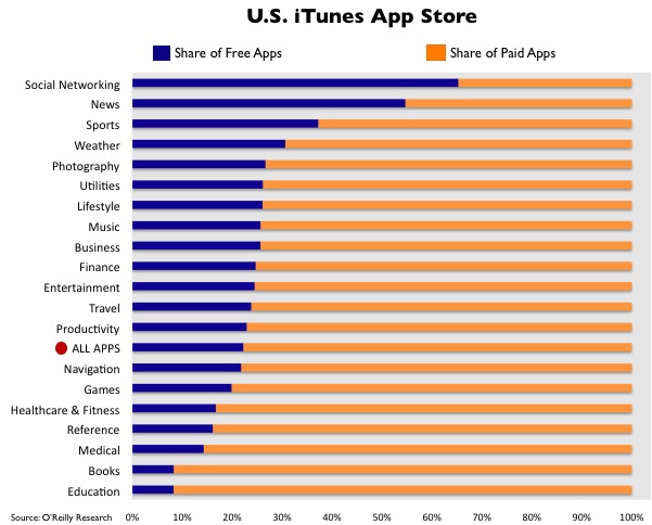
The thing that catches my eye: that the “Education” category has the highest proportion of paid apps. You might think—if you had no experience with the educational publishing industry in our country—that educational applications might be made freely available more frequently than games, financial or photography programs, just to name a few. Sadly, anyone that’s had to pay tuition and/or buy publications like textbooks, journals or (ahem…) magazines from educational institutions know that’s not the case: the educational publishing industry somehow manages to rip-off everyone in an age where content is becoming cheaper and cheaper in every other sector, and where you would think the primary creators and consumers of the content (educators and students) would be the most willing to freely share their knowledge. To be honest, I can imagine a bunch of explanations, but I’m not entirely sure why this is the case. This is just one more example of the trend though.
Tim O’Reilly saying interesting things about Twitter:
In many ways, Twitter is a re-incarnation of the old Unix philosophy of simple, cooperating tools. The essence of Twitter is its constraints, the things it doesn’t do, and the way that its core services aren’t bound to a particular interface.
It strikes me that many of the programs that become enduring platforms have these same characteristics. Few people use the old TCP/IP-based applications like telnet and ftp any more, but TCP/IP itself is ubiquitous. No one uses the mail program any more, but all of us still use email. No one uses Tim Berners-Lee’s original web server and browser any more. Both were superseded by independent programs that used his core innovations: http and html.
What’s different, of course, is that Twitter isn’t just a protocol. It’s also a database. And that’s the old secret of Web 2.0, Data is the Intel Inside. That means that they can let go of controlling the interface. The more other people build on Twitter, the better their position becomes.
O’Reilly also talks about how a large number of Twitter users use Twitter to update their Facebook status, which is exactly what I do. In fact, if you just look at my Facebook page, it looks like I’m fairly active on Facebook, until you realize that almost every thing in my profile is pulled into Facebook from other services like Twitter or this blog (via Wordbook). Thanks to the demise of Scrabulous, I pretty much only go to Facebook any more to approve friend requests and respond to people who comment on my Twitter status inside of Facebook instead of in Twitter.
I’m not sure what a Facebook that tried to untie its data from its interface like O’Reilly recommends would look like though. But an even more interesting thought experiment is this: what about a Facebook-like social networking system that works like laconi.ca, a Twitter-like piece of software where the data itself is decentralized on individual instances of the software but where the social networking & communication can occur across each instance. This gets around both the centralization of interface, but also the centralization of data, which is really a much bigger problem!