
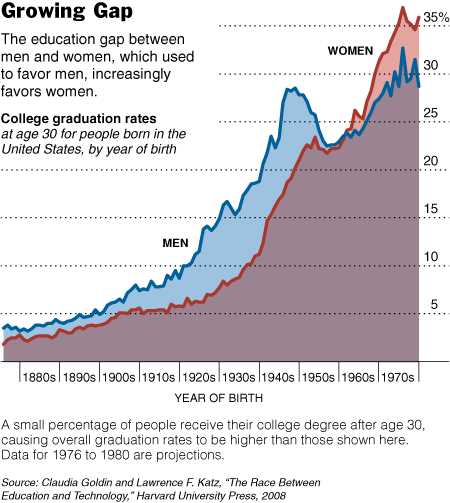
There are other things interesting about this graph too. (1) The overall increase in the percentage of the U.S. population who attends and graduates college… and thus changing ideas about who “needs” a college degree. (2) The fact that the gender difference wasn’t extreme in the late 1800s at all and increased in the early 1900s. (This is in contrast to most students understanding of history, in my experience, as a linear story of progress from backwards to enllightened.) (3) The spike in college enrollment and graduation after WWII (GI Bill… but how does that explain the stats on women?). (4) The weird dip in 1950s (I don’t know what that’s all about). And, (5) the period of near parity in the 1960s. (In the comments, Penny points out that I mis-read the graph in haste. I apologize.) (3) The weird dip for people born in the 1950s and coming of age in the 1970s (I don’t know what that’s all about). And, (4) the period of near parity for people born in the 1960s and coming of age in the 1980s.
See the accompanying article at the New York Times.
Comments 8
lucy — May 23, 2008
I just read this interesting article by Marilynne Robinson about how progress in terms of equal access to college hasn't been linear.
theunbeatablekid — May 24, 2008
i have a hunch that that weird dip in the 50's has something to do with the establishment of the middle class and the strength of the union. when high wage unskilled jobs are plentiful, there's not so much need for college. again, just a guess.
Penny — May 24, 2008
Note that the bottom scale is "Year of Birth" not "Year of Graduation"--so the big peak in the middle is for people *born* in the 1940s--educated in the 1960s and early 1970s.
Penny — May 24, 2008
Also--the graph only counts graduation--the "dip" among people born in the 1950s doesn't mean fewer of that cohort attended college, but maybe only that they were more likely to leave college without degrees earned before age 30. Example A: Bill Gates (born 1955, didn't finish college).
theunbeatablekid — May 24, 2008
the reason for my earlier comment is that college graduation dip reminds me a lot of a simultaneous dip in the share in income the top 10% in the US:
http://graphics8.nytimes.com/images/2007/09/19/opinion/19krugman2.533.jpg
on the other hand, it might not dip for those born in the late 50's as much as a bump for those born in the 40's-early 50's.
again, it's just more conjecture. information like college costs and number of colleges would be useful.
Lisa Wade, PhD — May 24, 2008
Thanks for that correction, Penny!
theunbeatablekid — May 25, 2008
I misread that chart too. Part of the reason is because that dip seemed to line up with what Paul Krugman calls the Great Compression:
http://krugman.blogs.nytimes.com/2007/09/18/introducing-this-blog/
At second glance, I'm not convinced that this dip isn't just a bump that includes the cohort born from the mid 30's to the mid 40's which is then corrected for those born from the mid 40's to mid 50's.
Sex, College Degrees, and Campus Equity » Sociological Images — May 22, 2010
[...] Nothing new there, in that scholars have been aware of this pattern for a while now. The author of the post on Carpe Diem uses this data to thus argue that women’s centers are no longer needed on campuses. He also asks, Didn’t the “journey toward equity” that is mentioned in the book [he discussed] end back in 1981 when women started earning a greater share of college degrees than men? [...]