
In a New York Times article today, Patricia Cohen describes the changing demographics of the American professoriate. It had two main points:
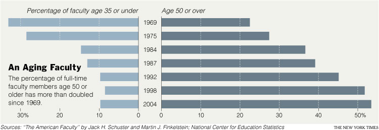
(1) Profs are WAY OLDER now then they used to be.
(2) The older ones appear to be more liberal than the younger ones, so we can expect academia to be more moderate as the older profs retire. This table shows how “liberal,” “moderate,” and “conservative” professors report being by age and academic field (click to enlarge so you can see it better).
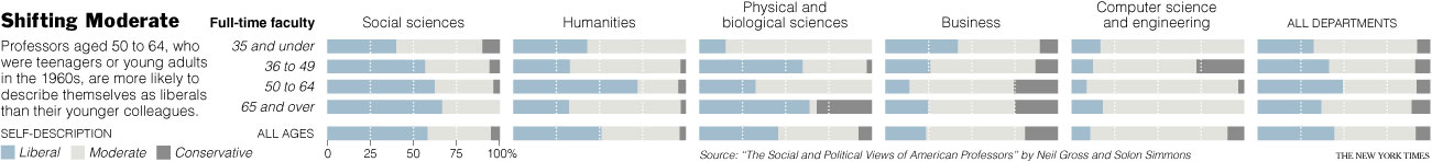
Cohen summarizes this table as follows:
‘Self-described liberals are most common within the ranks of those professors aged 50-64, who were teenagers or young adults in the 1960s,’ they wrote, making up just under 50 percent. At the same time, the youngest group, ages 26 to 35, contains the highest percentage of moderates, some 60 percent, and the lowest percentage of liberals, just under a third.
I’m not sure I buy it.
First, notice that they’re comparing two groups (26-35 and 50-64) and making a claim about a trend instead of a claim about group difference. You can’t do that. Look at the data on the age group between them (36-49), they are all over the place, not neatly sitated between the age groups that sandwich them. (This also points to the always interesting question of how the data looks if you chop up your continuous variables–in this case, age–differently.)
Second, if you stick to group differences, they are comparing the youngest group and the second to oldest group in their data. Why? If you compare the youngest to the oldest group, the data looks a bit different.
Third, their interpretation of the overall “trend”–that is, the average difference across all fields–is obscuring some really interesting variation by subfield! So maybe the overall interpretation works for the social sciences, but wow look at the physical and biological sciences! Again, here we see a choice about reporting that obscures one finding in favor of another. The choice to emphasize averages/means/medians versus ranges/variety has consequences for how we understand our world.
Finally, there is the possibility that what it means to be “liberal,” “moderate,” and “conservative” differs in a systematic way across age groups. The reporter doesn’t address this at all.
There’s are also some really interesting assumptions about what counts as “political” in the article. Cohen points to the fact that quantitative research is somehow thought to be inherently less ideological than pure theory or qualitative research. And she quotes Marxist sociologist Erik Olin Wright saying: “in the late ’60s and ’70s, the Marxist impulse was central for those interested in social justice.” “Now,” Cohen adds, “it resides at the margins.” But it seems to me that it is Cohen who is assuming that quantitative research isn’t justice-oriented. Her example of a not-so-politicized younger professor is Sara Goldrick-Rab, also a sociologist, who says, “My generation is not so ideologically driven.” But whose projects, detailed in the story, include college opportunities for low-income students and the way that welfare reform decreased college attendance by the poor. Goldrick-Rab also complains about the lack of support for women academics who are also mothers. Those all sound damn political to me. But Cohen writes, partially quoting Goldrick-Rab: “They [older professors] want to question values and norms; ‘we [younger professors] are more driven by data.’ ” In this sentence, Cohen puts values and data on opposite ends of a spectrum. (It’s also interesting how she opposes Goldrick-Rab’s quote to her own words, we have no idea what Goldrick-Rab meant to oppose to being data-driven.)
I am troubled by the reproduction of the binary between “objective” and “normative” “science.”
I love, however, seeing the places and people of my alma mater described! Go Wisconsin!!!
Comments 1
Gwen — July 3, 2008
It's also interesting that being "liberal" or caring about social justice is reduced to whether or not you rely on Marxism, as though there is no other possible theorist or perspective you might be drawing on--or that might be tangentially related to a Marxist-type perspective but not directly named after him. If we were all using the exact same perspectives as in the 1960s, that would mean either a) we had not advanced whatsoever in our scientific understanding of the world or b) the scientific perspectives of the '60s were so perfectly accurate that there's no need to improve on them...which would mean there's no reason for scientific study about social justice at all, I guess.
The more I think about this, the more annoyed I am by how stupid it is.