Photo by Mike Licht, Flickr/cc. https://www.flickr.com/photos/notionscapital/15297085447
The Converging Gender Wage Gap, 1980–2012
During the 1970s, women’s greater integration into the economy coincided with significant cultural and structural changes. One of the most popular television comedies during this decade was “The Mary Tyler Moore Show,” depicting the personal and professional challenges faced by a young, aspiring female news producer. Television shows like “I Love Lucy” were gradually giving way to ones such as “Police Woman,” “The Bionic Woman,” “Charlie’s Angels,” and “Cagney and Lacey”—all problematic in their own particular ways, but all centered on women taking on traditionally male-gendered occupational roles.
When the federal Bureau of Labor Statistics (BLS) first calculated the gender wage gap in 1979, the average earnings received by women were less than two-thirds those of men. As both the images and the realities of women successfully navigating professional careers became more commonplace, the wage gap disparity steadily narrowed: women’s wages represented 64% of men’s in 1980, 72% in 1990, and 77% in 2000. Progress has largely stalled since then, however, and has hovered around the 80% mark for more than a decade.
Curiously, this disparity looks less pronounced when we consider the wage gap for women in specific age groups. Variations of Figure 1 appear on the BLS website and in multiple sociology textbooks, suggesting that younger workers are working in far more equitable wage climates than their elders. How can both of these stories be true at the same time? How is it possible that women in specific age groups seem to be experiencing greater equity in wages even though the overall trend appears to be stuck at the same 80% level? It turns out that both of these trends are true, but demonstrating why this is the case also points out the enormous challenges ahead to make more progress.

While the lines in Figure 1 do show increasing parity—not only for all women but also each specific age group—they also mask a counterintuitive and disturbing decline. Taking a closer look at this graphic, consider the cohort of women born in 1970. When they are 20 years of age, they are in the youngest age group and their wages are 93% of men’s earnings. In 1995, when they are 25, we find them in the second line (because they are now in the 25-34 age category) and their wages are at 82%. Ten years later, in 2005, they are in the third category and their relative disparity is 76%. A similar pattern holds true for women born in 1960. They start their careers enjoying the highest level of pay equity for all age groups (78% in 1980), but by the time they are 40 years old they have lost significant ground (72% in 2000). While the trends for the age groups are generally positive, that apparently is not the case for members of different cohorts.
It is easy to misinterpret these findings. The BLS data, for example, are not making a direct comparison of male and female workers employed in the exact same job. They do not control for levels of experience or education; they ignore the fact that women are predominantly employed in occupations offering lower annual incomes. The statistics only calculate the median wages of all women reporting full-time work in the past year, presenting these figures as a percentage of men’s median wages. The individual snapshots are thus less informative than the overall trend. It’s an admittedly rough measure of inequality, but one that can easily demonstrate longer-term patterns and trends.
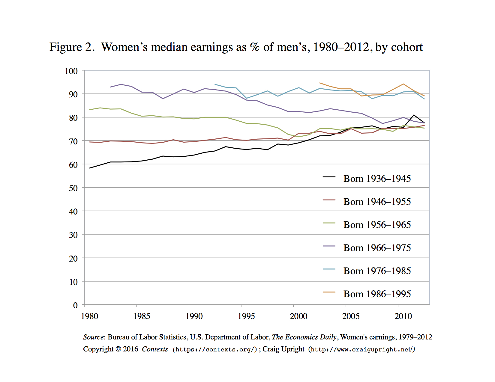
If we break up the BLS data into cohorts—groups of women born in specific time-periods—we can create a new series that shows generational trends. After constructing six ten-year cohorts born between 1936 and 1995, we see a very different pattern, as seen in Figure 2. Since 1980, only the two oldest cohorts have experienced the generally positive trend of decreasing inequality that characterizes Figure 1 and a narrative of continued but slowing progress. All younger cohorts born after 1955 began their careers with greater pay equity but have experienced decreasing parity since the 1980s. Most of the gains made in the overall trend—from 64% in 1980 to 81% in 2012—can be attributed to women born during the presidencies of Franklin Roosevelt, Harry Truman, and Dwight D. Eisenhower. Quite remarkably, the wage-gaps for the four oldest cohorts have recently converged, all clustering just under the overall 81% figure.
A final way to look at this data is to display it by age of the cohort members to see how the wage gap has changed during their lifetimes, as seen in Figure 3. Because the BLS didn’t begin systematically collecting and presenting this data until 1980, the trend lines are incomplete. We only have 1936–1945 cohort data, for example, starting when they were 40 years old. Similarly, the younger cohorts still have several decades of work ahead of them and the trend lines only track what they’ve earned so far in their lives.

How might we explain this convergence of wage-gap disparities across these different cohorts? Why did older women experience decreasing inequality as they grew older while younger women are experiencing the opposite? Three possible explanations would consider the wage structures of entry-level positions for younger workers, the distribution of men and women into different occupational sectors and roles, and, finally, the cultural expectations and economic realities of women’s employment participation in the later years of their lives.
As suggested in the original BLS reports, younger cohorts appear to be starting their careers with greater parity. We know they achieve higher levels of educational attainment than older generations. This is possibly also a result of lower initial wages in entry-level positions. When wages are relatively low for everyone, it is easier to achieve pay equity, especially given federal minimum-wage increases in the 1990s. Including these younger workers in the overall wage-gap statistics might have been masking the larger problem and showing more progress than was actually being made.
A second explanation for the divergent patterns considers the composition of the work force. Younger women have been increasingly making inroads into occupational sectors previously dominated by men, pursuing positions that also had greater compensation. While wage gaps also exist within these occupations, their higher wages could raise the median average for all women. This could explain why the trends for all age groups are positive, even though experiences of each cohort might be different.
A third possible explanation shifts from structural features to cultural ones, considering why female workers might have continued full-time employment or dropped out of the data series. Most of the progress in decreasing the wage-gap can be accounted for by the gains achieved by the older cohorts. These women grew up in an era when their labor-force participation (especially full-time work) was not the norm, when they were expected to spend their time and energies in the domestic sphere. The women who continued to work full-time throughout and past their middle ages might have had careers rather than simply jobs, and they stayed in positions that paid them relatively well. When the returns to work were higher, it made more sense to stay employed on a full-time basis. In the 1970s, for example, the few popular television shows featuring adult women working full-time depicted them as iconoclasts in professional settings. Mary Tyler Moore’s character was employed as an associate producer at a news station, while Angie Dickinson starred in the first police drama with a female lead actor.
Younger cohorts grew up in a society with very different cultural expectations and norms. As wages dropped during the 1970s, it became commonplace for families to have two working spouses. Women were increasingly delaying both marriage and childrearing, and the default expectations reversed: women were expected to work unless they made the conscious decision to stay at home or to only engage in part-time employment. As a result, they have continued to remain in the active workforce, even when faced with diminishing relative returns. They’re less like Mary Richards from “The Mary Tyler Moore Show,” more like “Roseanne” or the “Two Broke Girls” characters who had to work but often took menial jobs to get by. In other words, the gender wage gap might have always been present, and it might have long been a figure hovering around 80%, but it wasn’t until labor force participation levels for men and women reached similar levels that we have been able to see it.
In the 1950s, Americans howled with laughter as they watched Lucille Ball perform miserably in her job in the production line of a candy factory. The times have changed. Young women today are presented with a far greater diversity of role models and actual opportunities to explore vocations and callings in nearly every occupational field, and they are encouraged to succeed rather than fail. Their aspirations and our society will never reach their true potential, however, if it takes another 35 years for their compensation to approach equity with men’s.

Comments 12
Matty
July 18, 2016It's about time soeomne wrote about this.
Adelaide
September 30, 2016http://www2go.site/alef.ir
Mildred
October 12, 2016http://www.autoversicherung.tech/
Louise
October 13, 2016http://netcheck.tech/wjxh.com
Artrell
October 13, 2016http://autoversicherung.tech/kfz-versicherung-lkw-berechnen.html
Lina
October 21, 2016handy aufladen mit kreditkarte ohne gebühren
Lucky
October 23, 2016kuitao8.com
Destiny
November 3, 2016http://kfzversicherungkosten.tech/auto-tarif-berechnen.html
Viki
November 17, 2016http://crawlerweb.us/efesalud.com
geometry dash
November 7, 2019Thank you for sharing this useful article information. I am really impressed with the article you provided.
McKamey
May 2, 2020Thank you for sharing this useful information. I am really impressed with it.
McKamey
May 2, 2020Thank you for sharing this information.