
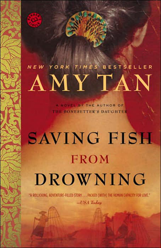
If you’re designing a cover for a book by a Chinese or Japanese writer, or with a Chinese or Japanese setting, it seems that there are some compulsory elements which must be included. For variety’s sake, there are four elements, but you MUST use at least one of them. Advanced designers, of course, may use two or more.
Element 1: Blossoms (preferably cherry, but anything red or pink will do)

Element 2: Fans (preferably held so as to partly obscure a woman’s face (or genitals), and if you can get blossoms on the fan, you get bonus points)
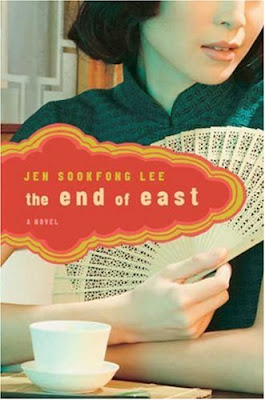
Element 3: Dragons (for use only on crime novels, or other exciting tales)

Element 4: Female Necks (preferably that of a geisha, but any female neck will do in a pinch)
For more on this trend, see this article from Hyphen Magazine, which features a brief interview with ace designer Henry Sene Yee. It was that article which also drew my attention to two covers featured above, those for On a Bed of Rice and The Street of a Thousand Blossoms.
(To be fair, I ought to note that several of these covers are actually very nice–it’s just that they lose rather a lot of their impact because of the familiarity of the elements used.)
James Morrison (jrsmorrison@yahoo.com.au) is a writer, editor and graphic designer who lives in Adelaide, Australia. He writes about book covers and book design at causticcovercritic.blogspot.com, and used to write about novellas at Book Slut. He blogs at Caustic Cover Critic. Thanks to Lisabee for the hat tip.
Comments 75
Kat — January 25, 2010
Another woman+woman's neck+flower contender: Tash Aw, The Harmony Silk Factory
Why the neck? Submissive "little Asian women"? Is that the point?
Deaf Indian Muslim Anarchist — January 25, 2010
aaaha! This post does not surprise me. since I am Indian, I often read a lot of Indian or Desi American books, both fiction and non-fiction. These covers are usually cliched, adorned with a woman's henna'ed hands or covered with paisley patterns (like this: http://needled.files.wordpress.com/2009/07/paisley.jpg).
if all else fails, just use a photo of TAJ MAHAL on the cover. God, I hate that.
It's rare to see an actually unique cover for an Indian/South Asian novel.
Nathan — January 25, 2010
Great design analysis. I might give the Murakami book a pass, since it has both 'willow' and 'woman' in the title, and keeps with a pretty simple Sual Bass-y design.
eruvande — January 25, 2010
To be fair, "Snow Flower and the Secret Fan" actually does involve a fan as a major plot point. :)
Pat — January 25, 2010
Ha ha! Confirmation bias is fun. We can play this game with lots of things.
FAIL.
kitty — January 25, 2010
Another often-used element in cover designs for Chinese, Japanese and Korean fiction: "Asian-y" looking porcelain or ceramics. Here are a few examples off the top of my head, all Chinese authors:
The Noodle Maker, by Ma Jian.
Eric Liu's memoir.
Love in a Fallen City.
(I hope the html is okay here - my apologies if it screws things up.)
Sometimes this seems sensible - after all, bowls for noodles make sense on the cover of a book called 'The Noodle Maker." Sometimes it is gorgeous and effective, like the contemporary sculpture by Ah Xian on the cover of Eileen Chang's collected fiction. I think the ways in which Ah Xian and Eileen Chang explore cultural, spiritual and political identity in their respective works makes this juxtaposition really evocative. Sometimes, though, it just seems random, even to the point of being thoughtless. I can't find an image, but I recall a French edition of a book by Kenzaburo Oe that had a Qing dynasty vase on the cover. Huh?!
John Yum — January 25, 2010
I wonder how much of this is an Australian Western construct. Looking up some of the list of books shown above on Amazon.com and Amazon.co.uk (and Amazon.de if I could find a German-translated edition of the book), I found some different covers. True, some of the above share the same (or very similar) cover art across countries, but others don't. Furthermore, there usually was a different cover for the hardcover and softcover editions.
Furthermore, if one looks at the other books that these people have published (thus easily looking how well these elements hold over other types of East-Asian literature written by these authors), you see a variety of different types of images, including buildings, faces, old people, young people, traditional clothing, modern clothing, etc.
So, in the end, my question is, so....
Also, what about literature on Korea? Why drop Korea from the mix of book covers? Is it because literature about Korea doesn't draw upon the same sorts of themes? (Probably not...) Is it because there isn't a large amount of Korea-themed literature? (Maybe...) Has the author not checked this group of literature? (Maybe...) Or is it something else?
Anna — January 25, 2010
While the design elements remain alarming, I would like to thank you for posting the book list. Far too often, books by Asian (or Asian-Canadian, or Asian-American) authors are never included on must-read lists, and so they rarely make it onto my wishlist.
While I was adding a couple of these to my amazon wishlist, I noticed that several of the books have alternative covers (thank goodness). But when I looked at my choices listed together, I recognized another pattern: a fragment of a young, western-defined beautiful, hip-looking Asian woman's face dominating the entire page. There's usually a focus on her mouth, either via bright lipstick or an emphasis on food. Most of the Natsuo Kirino books I've seen use this motif, as does the alt-cover of "Twenty Fragments of a Ravenous Youth."
hampshireflyer — January 25, 2010
There's been a discussion on The World SF News Blog about the cover of a speculative fiction anthology by ethnic Chinese writers, which has been designed with a Western dragon on it, and whether the publishers ought to have used a Chinese dragon instead....
Phoenix — January 25, 2010
Interestingly, I've been an avid fan of Laurence Yep's books (about Chinese and Chinese-American people, often set in China) for years and they tend to just have pictures of people intended to represent the characters. Unless there are actually dragons in, of course. Another of my favorites, Lloyd Alexander's _The Remarkable Journey of Prince Jen_, is also set in ancient China and has none of these cover elements, except perhaps for the flute girl (who's a main character, so arguably has a place there.) The common thread with those books is that they're "for children". Just another dimension here.
Tiago — January 25, 2010
Great article! Thanks
cht — January 25, 2010
Is it possible someone could post the covers of popular novels written by native Chinese (or Japanese) for other native Chinese/Japanese so we could compare those designs with their overseas (if applicable) counterparts?
g — January 25, 2010
it's funny that the guest blogger only talks about japan and china, whereas korea totally goes unnoticed, even though it is a part of the same cultural area -- east asia. we in the west only need to care about the big players. countries in the periphery don't matter. even though economically speaking, korea isn't at the periphery.
Michael Stevens — January 25, 2010
To be just a little bit picky ;-) "The World of the Shining Prince" does feature a man in the top left corner, and given that this is a description of the excruciating, nightmarish etiquette of courtly life in Heian Japan I think the cover is ok for the content.
But for most of the rest, yes quite a bit of stereotypes and laziness in the imagery
g — January 25, 2010
there's a similar post about how books by asian-american authors are stereotyped: http://bookoblate.blogspot.com/2009/08/asian-american-book-covers-cliched.html. don lee is a korean-american writer. so are suki kim, susan choi, leonard chang (his covers feature no females, maybe because they're crime novels?) and chang-rae lee (his covers differ, too), and many others. heinz insu fenkl is from the older generation.
as of translated korean literature (after 2001), check out this bibliography: http://hompi.sogang.ac.kr/anthony/TranslationList.htm. (before 2001 can be found on the same website.)
Erika — January 25, 2010
http://www.amazon.co.jp/gp/search/ref=sr_kk_2?rh=i%3Astripbooks%2Ck%3A%E7%9B%B4%E6%9C%A8%E8%B3%9E%E5%8F%97%E8%B3%9E%E4%BD%9C%E5%93%81&keywords=%E7%9B%B4%E6%9C%A8%E8%B3%9E%E5%8F%97%E8%B3%9E%E4%BD%9C%E5%93%81&ie=UTF8&qid=1264472235
Some Naoki award winning books -- the covers are very non-Orientalist, obviously, because it's written by Japanese people for Japanese people.
I've noticed the flowers-fans-women trend with book covers, and think it's rather unoriginal and lame.
Tweets that mention Guest Post: How to Make a Chinese or Japanese Book Cover » Sociological Images -- Topsy.com — January 25, 2010
[...] This post was mentioned on Twitter by Paulo Querido, Antonio Granado, Sam Han, SocImages, Pedro Magalhães and others. Pedro Magalhães said: Faltava o link: http://trunc.it/50gyg [...]
Shmeh — January 26, 2010
None of my Murakami books (which were printed in the US) have these features, with the exception of Norwegian Wood, which has a cute girl on the front with circles to indicate John Lennon-esque sunglasses, but that whole book is about a love affair with a girl that fitst that description, so it makes sense.
Then again, I don't have all of them.
I have noticed this trend, though, which is why I love my Murakami covers.
Chuck Spidell — January 26, 2010
Kung-fu fonts are also mandatory.
Christian in NYC — January 26, 2010
The thing about stereotypes is that they are based on truths.
People complain about stereotypes but stereotypes work. Which is why they continue to be used. Sorry if I'm sounding like Don Draper here but there is a lot of whining in the comments, as though some great design crimes have been committed.
Perhaps cherry blossoms, fans, dragons and geishas are cultural cliches. But that can be said of Europeans or Asian or South Americans or Africans depicting Americans as cowboys. Or all eating hamburgers.
What's disappointing about the designs is that they bring nothing new to the use of cherry blossoms, fans, dragons or geishas. That's the real problem. That just makes them not terribly compelling, which describes about 90% of the stuff in our world, probably more.
But I don't see the use of fans, dragons, blossoms, geishas as any sort of trend. That's absurd. These are all elements that have literally hundreds of years of cultural significance. Are they overused? Is the US eagle overused as a symbol of American patriotism? Can you come up with something better?
I don't see any of these elements as a "trend". The writer talking about this like it's a trend is the same silliness as those ridiculous "trend" pieces written in the Sunday NY Times -- a writer finds a few anecdotal examples of something that bugs him/her and then constructs a fictional trend around it. Like the writer is dumped by Facebook, so she writes about all the people now being dumped via Facebook, etc. It's silly.
If there is a lazy visual short for showing something "Asian", then sure, you have brought [cough] keen insight into that. Piercing insight.
Personally, I see nothing particularly wrong with the usage of any of these elements. They do their job, if that job is to convey a setting. Are they lazy? Sure. Maybe they are. But you're discussing book covers, which is a step above discussing candy wrappers. It's not art, it's a commercial product trying to sell something. I know we all want to believe we're artists, but really, we're just glorified candy wrapper creators.
— Cover Me — January 27, 2010
[...] http://thesocietypages.org/socimages/2010/01/25/how-to-make-a-chinese-or-japanese-book-cover/ [...]
Asian = Exotic » Sociological Images — January 28, 2010
[...] least the ads don’t have cherry blossoms. 7 Comments Tags: clothes/fashion, commodification, gender, gender: beauty, [...]
Orientalism in Mainstream Book Covers : Asian-Nation : Asian American News, Issues, & Current Events Blog — February 3, 2010
[...] another examples, my fellow sociologist bloggers at Sociological Images alerted me to an interesting post by Caustic Cover Critic (CCC) that examines stereotypical [...]
Superbowl Sunday Links « Bib-Laura-graphy — February 7, 2010
[...] isn’t the only racism we see on book covers. Check out this post on the consistent use of stereotypes on the covers of books with Asian authors of [...]
Wendy Nelson Tokunaga — February 8, 2010
Very interesting post and comments. My book falls into the same category and you can see the cover here:
http://tinyurl.com/y9sjy78
However, I'm very happy with the cover as it reflects the theme of the book, though I could have done without chopsticks in the hair. :-) And, as I assume you know, authors rarely have input on their covers.
Also, the trend of showing only part of a woman's face is common in many fiction book covers these days and is not limited to Asian women.
Bodies, Book Covers, and Novels about Large Women » Sociological Images — March 5, 2010
[...] posts about books: how to make an Asian book cover, evolution of the Dungeons and Dragons playbook, and do bookstores segregate books with African [...]
Blase — March 5, 2010
forgive me if I'm being counterproductive, but do you think its worth taking a sociological note that this is titled "how to make a chinese or japanese book cover" and doesn't take other east asian countries into mind?
More on Book Covers – and Korean lit gone missing — May 9, 2010
[...] time ago I mentioned a post at http://thesocietypages.org/socimages/2010/01/25/how-to-make-a-chinese-or-japanese-book-cover/ discussing the art cliches used in “Asian” book-covers in general. I also noted this [...]
Links of Great Interest: Don’t Taze My Granny! | The Hathor Legacy — July 3, 2010
[...] I don’t mean to alarm you, but The Last Airbender might not be a very good movie. Here’s more on why it’s both sucky AND racist. Here’s why we can’t stop the signal. More on racebending in fiction. [...]
Shin Kyung-Sook’s “Please Look After ??”: Covering the genre bases — April 16, 2011
[...] brilliant, because a foolish consistency here might have damaged sales. The good folks over at The Society Pages have theorized, a bit sarcastically, that the recognizable cover should have four [...]
How Book Covers Translate Cultural Symbols | Nanoomi.net — April 18, 2011
[...] brilliant, because a foolish consistency here might have damaged sales. The good folks over at The Society Pages have theorized, a bit sarcastically, that the recognizable cover should have four [...]
Shin Kyung-sook Miscellania – Book Covers and Old Blighty — July 9, 2011
[...] fan-like (For more of a discussion of this kind of treatment of Asian bookcovers please see Sociological Issues and Korean American Readings). And, you know what? That stuff [...]
Madam Miaow — April 13, 2012
BLEURGH!!! Very funny and right on the money. Paul Mason's Rare Earth is an exception as the cover is illustrated with Chinese biker women looking as unlike a lotus blossom as is possible. Thinking about the cover of my imminent poetry book, guess what won't be on the cover ... unless heavily ironised.
orientalism #1: wheel of fortune. « My Beautiful Bookshelf — April 16, 2012
[...] - “Community” Season 1 Episode 1: intro to Senor Chang - How to Make a Chinese or Japanese Book Cover, by James Morrison (The Society Pages) - “Message from a Nightingale” scene, The Drowsy [...]
Butterflies, Slumdogs, And Tiger Moms: Asian American Women And The Rescue Narrative | Adios Barbie — May 1, 2012
[...] sorts of modern cultural spaces, including Asian and Asian American book covers, as demonstrated by this helpful instruction manual constructed by Sociological Images. My favorite tip is Element #2: “Fans (preferably held so as [...]
Downcast, Decapitated and Dead: Why Don’t Women on Book Covers and in Ads Stare Back? | Adios Barbie — May 22, 2012
[...] image of headless surrogates and so many others I saw in the media. Consider, for instance, that Asian American book covers often have images of women’s faces which are downcast, or partially covered (say, by a fan). Or, think about the spate of dead or dead appearing young [...]
The Male Privilege Plot: How Jeffrey Eugenides Broke My Fragile Woman Heart | Broad! — October 3, 2012
[...] “African-American Literature”), by way of cover art (Sociological Images has a good breakdown on this regarding work by writers of Asian descent). These stories are othered. We want to [...]
La portada de un libro - techleo — May 14, 2014
[…] y territorios se asocian con determinados símbolos, como África y el paisaje con su acacia o Asia y las flores, abanicos, dragones o mujeres misteriosas. Dependerá de nosotros continuar la tendencia o intentar destacar lo que hace distinto a nuestro […]
gelede — May 17, 2014
Africaisacountry did a similar story on novels set on the continent of Africa.
Alan Spence, una guía y una queja. | Eugenia Andino — December 17, 2014
[…] un libro que no sea ni novedad ni un clásico. Incluso ver una portada que no sea lo mismo de siempre (más y todavía más). Los libros se convierten en copias hasta el infinito, por dentro y por […]
Three Times Simcheong (in Full) | Seoul Stages — March 12, 2016
[…] share some aesthetic traits – I hope that the closed eyes, in particular (though not as bad as the typical book cover of novels from East Asia in translation) won’t become a trend – but these are, in fact, three quite different versions of Simcheong-ga […]