7 things maps tell us about neighborhoods
Sociologists can use mapping to describe communities and analyze relationships within them, painting a picture of how individuals interact with their neighborhoods and how those neighborhoods shape opportunities.
Neighborhoods are important in determining both access to resources and negative exposures. Geographic Information Systems (GIS) maps provide insight into where we live and what is available, expanding our understanding of place and its role in overall wellbeing. They can be descriptive or analytic, interactive or static, visually stunning or utilitarian. To give a taste of what’s possible, here are 7 things we can learn about our neighborhoods from maps.
Healthy food access and consumption
Lucan and Mitra mapped several food-related variables in Philadelphia, examining both access to fresh produce and consumption of both healthy and fast food. Using a series of maps, the authors find that access to produce is associated with higher produce consumption and lower fast food consumption. The maps below show these relationships, with shaded areas representing higher fruit and vegetable intake, higher fast food intake, poorer quality groceries, poorer access to supermarkets and limited access to produce in the neighborhood.

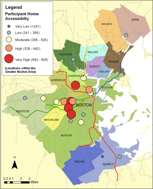
Access to resources and community integration
Chan et al. asked formerly homeless adults in Boston to identify the community resources – stores, parks, libraries that were important to them in their neighborhoods, and weighted the locations accordingly. Using these data, they created “accessibility indices” to determine each participant’s level of access to community resources. Access to resources is associated with social integration. Each of the circles on the map represents an individual’s home, and the circles are sized and color coded to represent that individual’s level of access to community resources. Areas with larger circles represent neighborhoods where formerly homeless adults have greater access to resources.
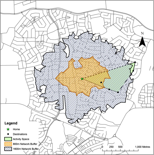
Gender differences in children’s spaces
In Perth, Australia,Villanueva et al. used pedometers and GIS mapping to track the places children visit and determine their “activity spaces” in relation to their homes. Girls, age 10-12, generally have smaller activity spaces than did boys the same age, and girls’ activity spaces were more limited by perceived traffic than boys’ were. The map here displays how the researchers displayed one child’s activity space. The green triangle on this map represents an individual child’s activity space, with the home starred. The blue and orange areas show 1600 and 800 meter pedestrian buffers around the child’s home, illustrating the geographic area covered by an 800 meter (about a half mile) or 1600 meter (about a mile) walk from home.
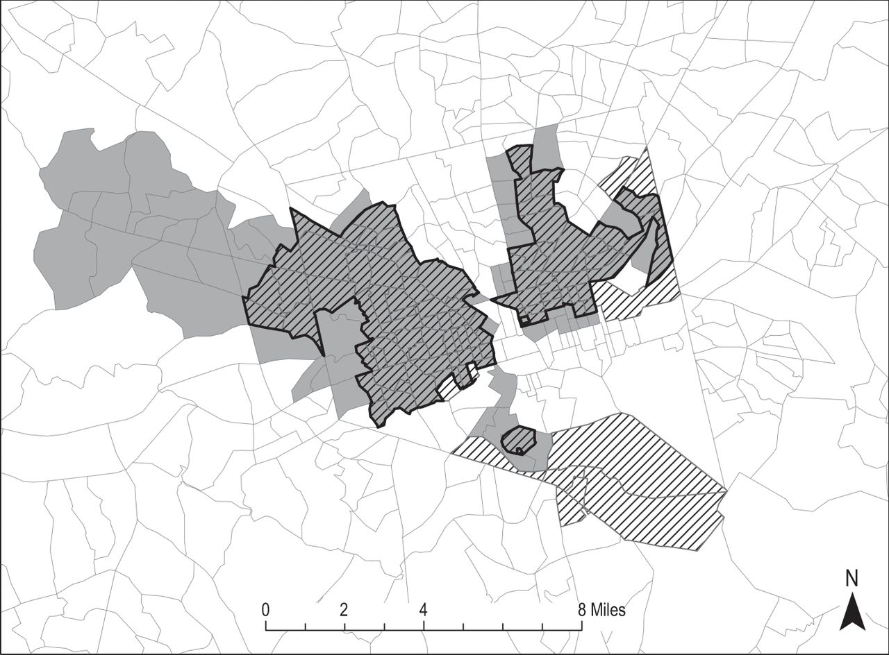
Subprime lending by race
Hwang et al. looked at subprime lending in Baltimore and found that these loans were concentrated in geographic areas that were densely populated by racial minorities. The research shows that higher levels of subprime loans were issued in clusters of Census tracts with higher Black and Hispanic populations, rather than individual tracts interspersed with majority White tracts. Showing that proximity to majority White tracts was a protective factor against subprime lending, but that in concentrated minority areas, lenders were able to target these communities. Striped areas represent clusters of tracts with more subprime lending, grey areas illustrate clusters with higher proportions of racial minority residents and the bold outlined areas represent the overlap.
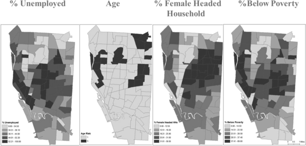
Substance abuse risk by proximity and demographics
Mendoza et al. looked at risk of substance abuse, identifying risk factors (alcohol outlets) and protective factors (treatment centers) within neighborhoods in Buffalo, New York, as well as socioeconomic factors related to treatment outcomes. Their maps allow for an analysis of total risk for a neighborhood, combining socioeconomic and physical proximity to create a complete picture of environmental factors linked with alcohol abuse. The first map shows socioeconomic risk, using age, poverty and other household factors. The second illustrates the ratio of alcohol outlets to treatment centers, where darker areas are higher risk, indicating physical vulnerability. The third map combines the two.
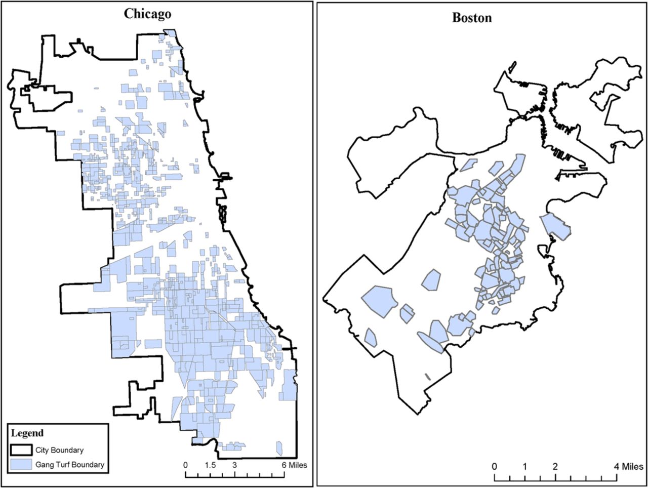
Gang proximity and interaction
Integrating social network analysis and GIS mapping, Papachristos et al identified gang turf locations in Chicago and Boston, as well as ties between those gangs. The spatial relationship between gangs is a key factor in violence between them. The authors described areas where two groups’ boundaries are adjacent as “corners” and found shared boundaries predicted a higher probability of violence between gangs. The blue highlighted areas represent separate areas of gang turf, as defined by police, and the grey boundaries are the corners.
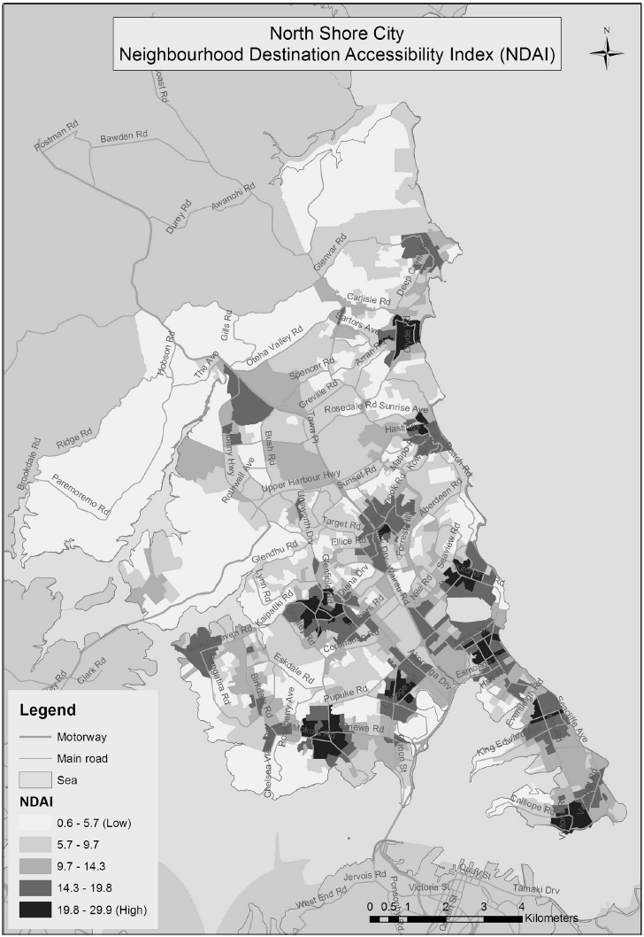
Aggregating neighborhood resources
Considering neighborhood resources in aggregate, Witten et al developed the Neighbourhood Destination Accessibility Index to identify areas with higher and lower pedestrian access to education, food, recreational, employment, social/cultural and retail access. The index was used to compare accessibility across cities as a tool for neighborhood physical activity research. This map shows North Shore, New Zealand, with darker areas representing greater access to resources and lighter areas with lower index scores, highlighting areas where resources are concentrated.

Comments 1
Andrew
November 12, 2020Thanks for this post. Very interesting.
Andrew from liveadultcamsites.com